Kalibrate’s first major software release of the year focuses on making day-to-day work faster, improving how you work with data on the map, and helping teams get to clear answers with less effort.
In addition to the changes you can see, this release also includes performance and bandwidth improvements that increase speed across the platform – from loading data to working with large datasets.
The Q1 release is part of the broader Kalibrate Location Intelligence roadmap for 2026, focused on refining the core experience so teams can work more efficiently and spend more time making decisions instead of managing the tool.
This article highlights the updates now available in KLI.
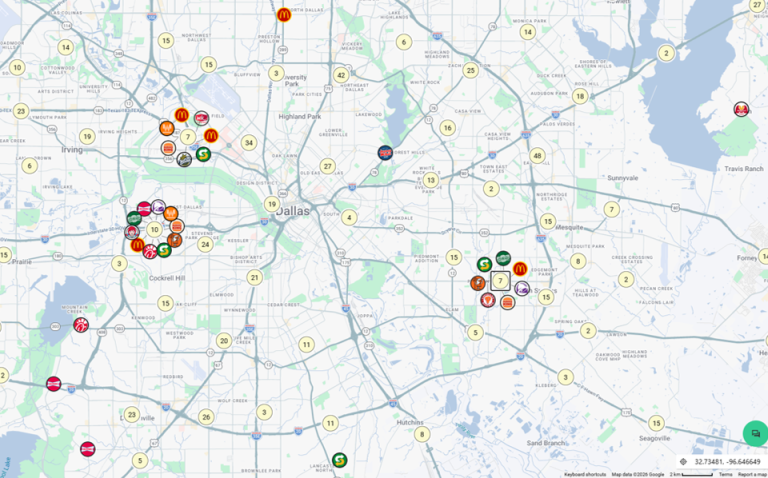
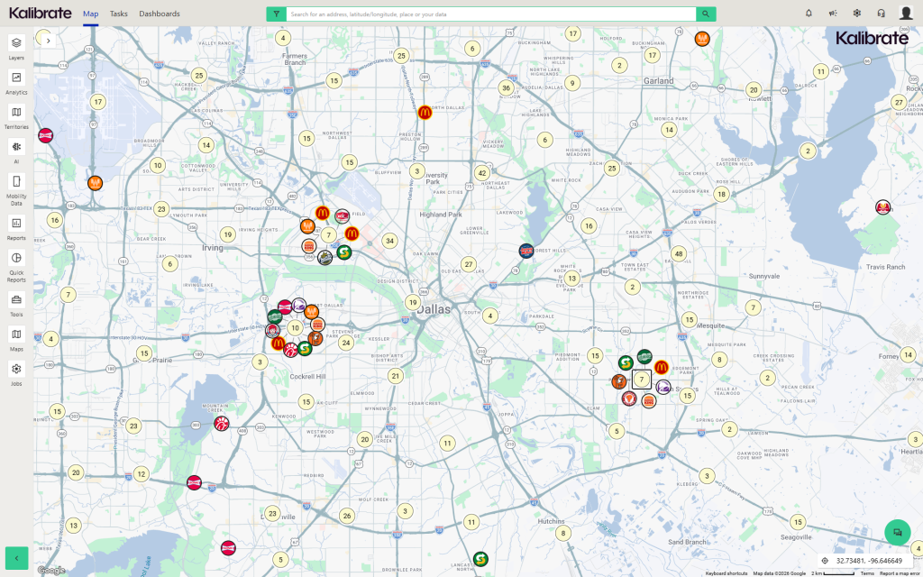
Clustering
Exploring crowded markets and overlapping locations is now easier. Clustering groups nearby locations into a single symbol, with clear counts showing how many locations are included, so you can quickly understand density at a glance.
You can use spiderfy to expand clustered points and inspect individual locations, or zoom in to break clusters apart in real time – first into smaller groups, then into individual sites. This lets you move from a market-level view to exact location details without changing layers or resetting your view.
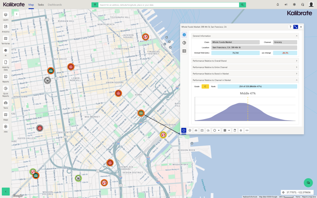
The thematic information tool now stays visible as you move around the map, making it easier to compare data side by side without interrupting your workflow.
Ad Hoc tool enhancements
The Ad Hoc tool in KLI allows you to import, create, manage, and share custom data layers for mapping, reporting, and bulk processing. It’s commonly used by GIS analysts, operations teams, and site selection teams to bring in external datasets and visualize them alongside existing data.
Ad Hoc supports tasks like integrating proprietary datasets, analyzing site-level performance, and building custom spatial analyses that can be shared across teams.
In this release, the Ad Hoc experience has been rebuilt around a simpler, single-panel interface that is faster to use and easier to navigate.
Key updates include:
- Full control over symbology for both points and shapes, including basic, value-based, and range-based options
- Improved column formatting, with support for number, currency, percentage, and other formats directly in the Ad Hoc manager
- Faster imports and improved map rendering performance, especially for large datasets
- Expanded export options with support for multiple file types
- Additional analysis tools – such as demographics, closest stores, and map books – available directly from the Ad Hoc toolbar
- Improved sharing and collaboration, including the ability to share with specific users or roles as read-only or editable
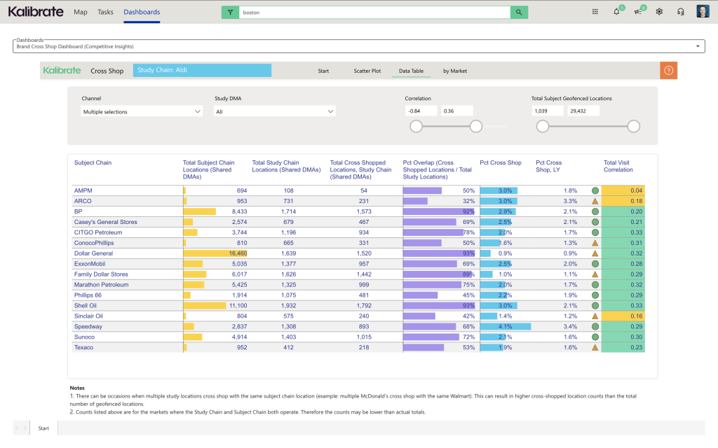
Competitive Insights updates
This release includes updates to the Activity Hub and introduces a new Cross Shop Dashboard, giving teams a clearer view of competitive activity at both the site and brand level.
The Activity Hub has been updated to improve visual clarity, making it easier to scan and understand what’s happening at a glance. You can now also see pending locations marked as “coming soon,” giving earlier visibility into competitive data before it’s fully available in the platform.
The new Cross Shop Dashboard shifts the view from individual locations to brand-level behavior. It shows where customers are also shopping across brands, using aggregated visitation data – not just proximity – so you can see real patterns in how people move between brands.
This makes it easier to understand who you’re truly competing with for customer share and where there may be opportunity.
Teams can use the Cross Shop Dashboard to answer questions like:
- What brand partnerships make sense?
- How does this market behave differently?
- What brands should we co-locate with?
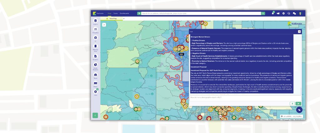
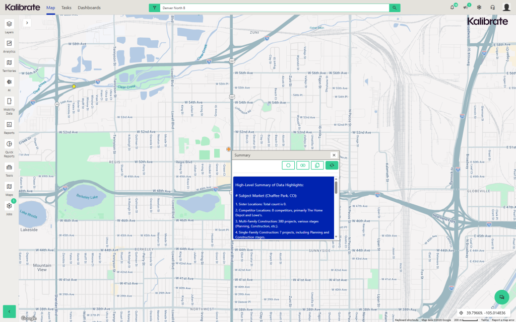
AI-driven insights with Market Summaries
Market Summaries are now available directly on points through the Activity Hub. You can generate short, readable summaries for areas around individual locations, making it easier to understand what’s happening without digging through multiple datasets.
These summaries add clear context at the trade area and market context at the site level and help you quickly interpret spatial and demographic data as part of your workflow.
Pin, label, and symbol controls
Users can adjust pin color and size by layer, switch between label and symbol groupings, and manage visibility more precisely within layered legends.
These updates reduce the need for admin setup and make it easier to change how data is displayed as analysis evolves. Users can quickly cycle between label and symbol sets to view different perspectives on the same data – without creating new layers.
Additional enhancements
- Speed and performance improvements
- Bulk demographics from Mini Reports
- Improved layer visibility controls
- Persistent thematic info tool for side-by-side comparison
This release sets the tone for 2026 by prioritizing usability and performance across the platform. Want to see it in action?
Request a demo with our team